
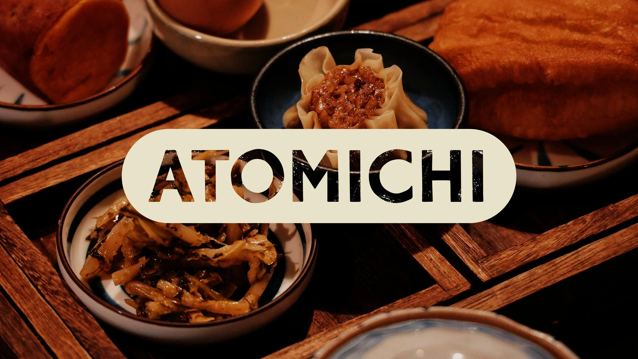
Atomichi
services brand system, illustration, packaging design
designed at george brown college
As a design student, I was assigned a brief to name and brand an izakaya in Toronto’s Queen West neighbourhood. The target customer base was middle-income urban professionals from 25–35, a group always looking for an exciting new place to check out for after work drinks. The goal was to create a cohesive and exciting brand identity system for the downtown izakaya that speaks to this target audience, while incorporating some of the owner’s own personal interests.
Atomichi’s brand system is primarily informed by the owner’s interest in collecting mecha, vintage Japanese tin robots. By drawing inspiration from famous mecha, their packaging and the effect of age and wear on both of them, Atomichi has a unique, grungy feel that appeals to a young, urban professional, creative clientele.
The Name
To name this izakaya, I researched Japanese words pertaining to nightlife, entertainment and food as well as famous mecha toys. After major brainstorming (see below), I came up with the name Atomichi, a port-manteau of Atomic and Ichi. Atomic refers to Atomic Robot Man, one of the first mecha toys designed. Ichi is the Japanese word for one.


Brand Elements
The brand feels both nostalgic and brand new, incorporating stamp-effect icons of both vintage robots and traditional izakaya imagery: a sake set, chop- sticks, a ramen spoon and beer bottle. Muted shades and halftone patterns coincide with this vintage tone and unite all icons despite mecha and izakayas not being intrinsically related. Incorporating distressed and retro textures into the identity further communicates the unique nostalgia that Atomichi’s brand system holds.


Collateral
In order to flesh out the brand, I designed menus, takeaway bags, promotional items and packaging for Atomichi.


